komoot
Enhancing user acquisition, activation, and user experience.
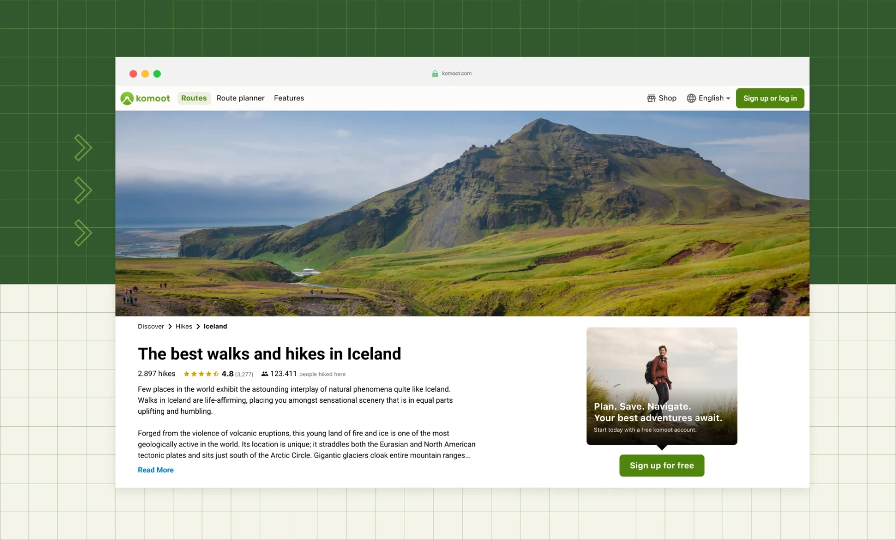
Our squad owned komoot’s web journey from first visit to activation. I led the user research, owned design iterations and prototyping, and turned data and research insights into testable solutions. Most changes shipped behind an A/B test.
Context
komoot is a route planner app offering tailored route recommendations for any activity, anywhere. With 22 million active users in 2025, it helps people find, plan, share and track outdoor adventures.
Our squad owned all of komoot’s landing pages and the web journey from first visit to activation, the seven-day explorer window. We worked closely with the data science and growth teams, who owned monetisation and retention, so analytics, research and A/B tests were part of how we made most decisions.
My role
I was the product designer in the squad. I led the user research, owned the design iterations and prototyping, and worked with the team to turn what we learned into things we could actually test. I also contributed to the design system and to how the wider team ran research.
Deep dive: guide and tour pages
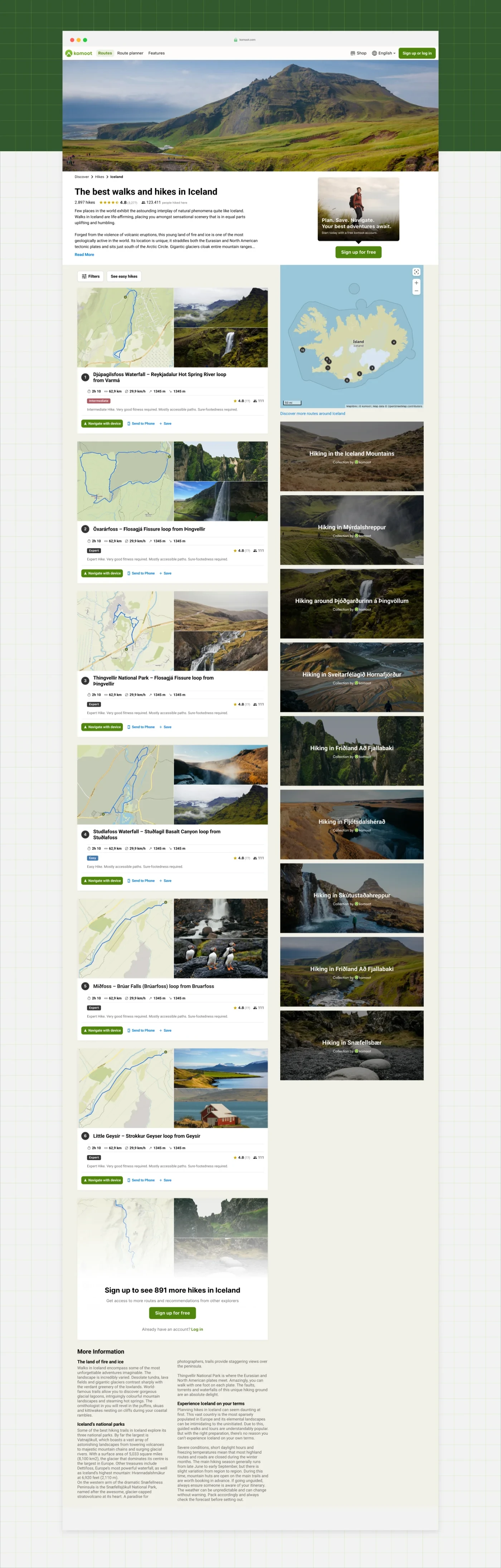
Guide and tour pages were our highest-traffic, highest-signup content type, bringing in 36% and 45% of all web signups. So when a change to how content was displayed meant we had to rethink these pages anyway, it seemed like a good place to spend our effort.
Our goals were to clearly communicate komoot’s value proposition and the benefits of creating an account, help people find the perfect route, and inspire them to go out within the next seven days.
→ See Guide page in selected screens
Process
We started with product analytics, to see how the content changes had affected behaviour and our main KPIs. That told us what had moved but not why, so we followed up with qualitative research.
We ran ten unmoderated usability tests and interviews on mobile and ten on desktop. We matched the structure of an earlier study on purpose, so we could compare results instead of starting from scratch. From there I iterated design directions against our goals, and we scored them together on an impact-effort scale.
What we learned
We were surprised to learn that most people simply didn’t realise a komoot account was free. We confirmed our assumption that the signup popup was frustrating for most visitors, but removing it wasn’t possible at the time, so we focused on its timing instead.
We’d also assumed that komoot’s community and its user-generated content would be the most compelling reason to sign up. The A/B test suggested otherwise. People visiting the site for the first time intended to find a route, and were more motivated to create an account and see more content when they could see exactly how many routes they’d get access to. The rest of the research gave us useful material to work with:
- People paid the most attention to photos, using them to judge whether a route would be interesting
- Star ratings and route stats built credibility and trust
- People found the content useful and engaging despite the new limitations and the signup wall
- The mobile version of the site was difficult to navigate
What we shipped
We went for the overlap between what the research told us, what we were trying to achieve, and what didn’t need much engineering time. Almost everything shipped behind an A/B test.
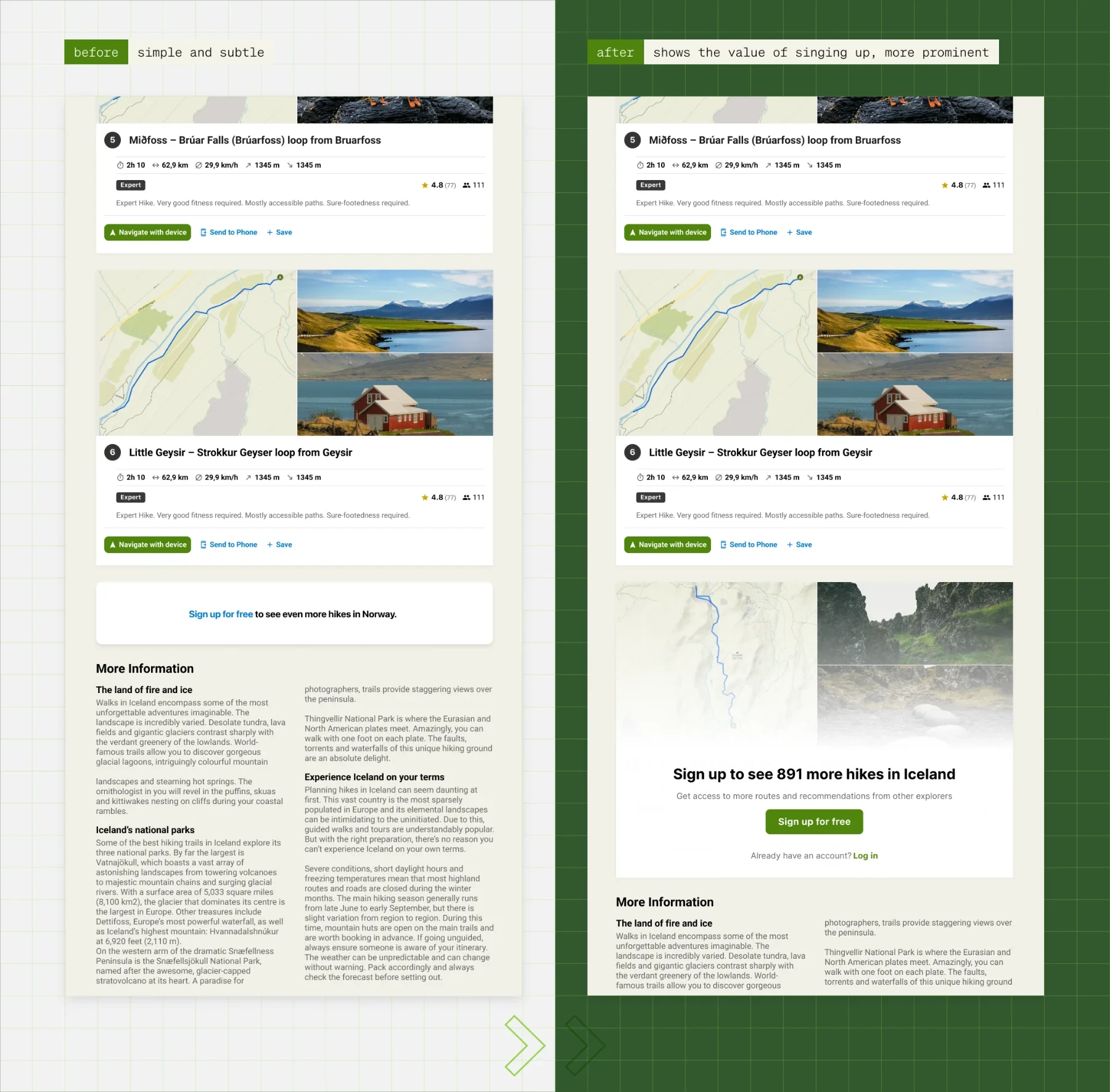
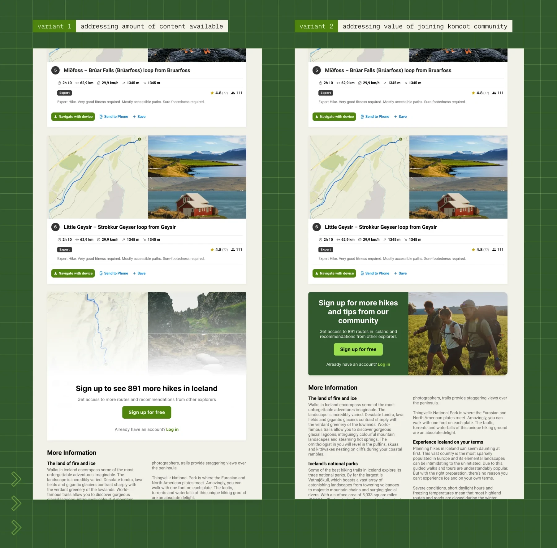
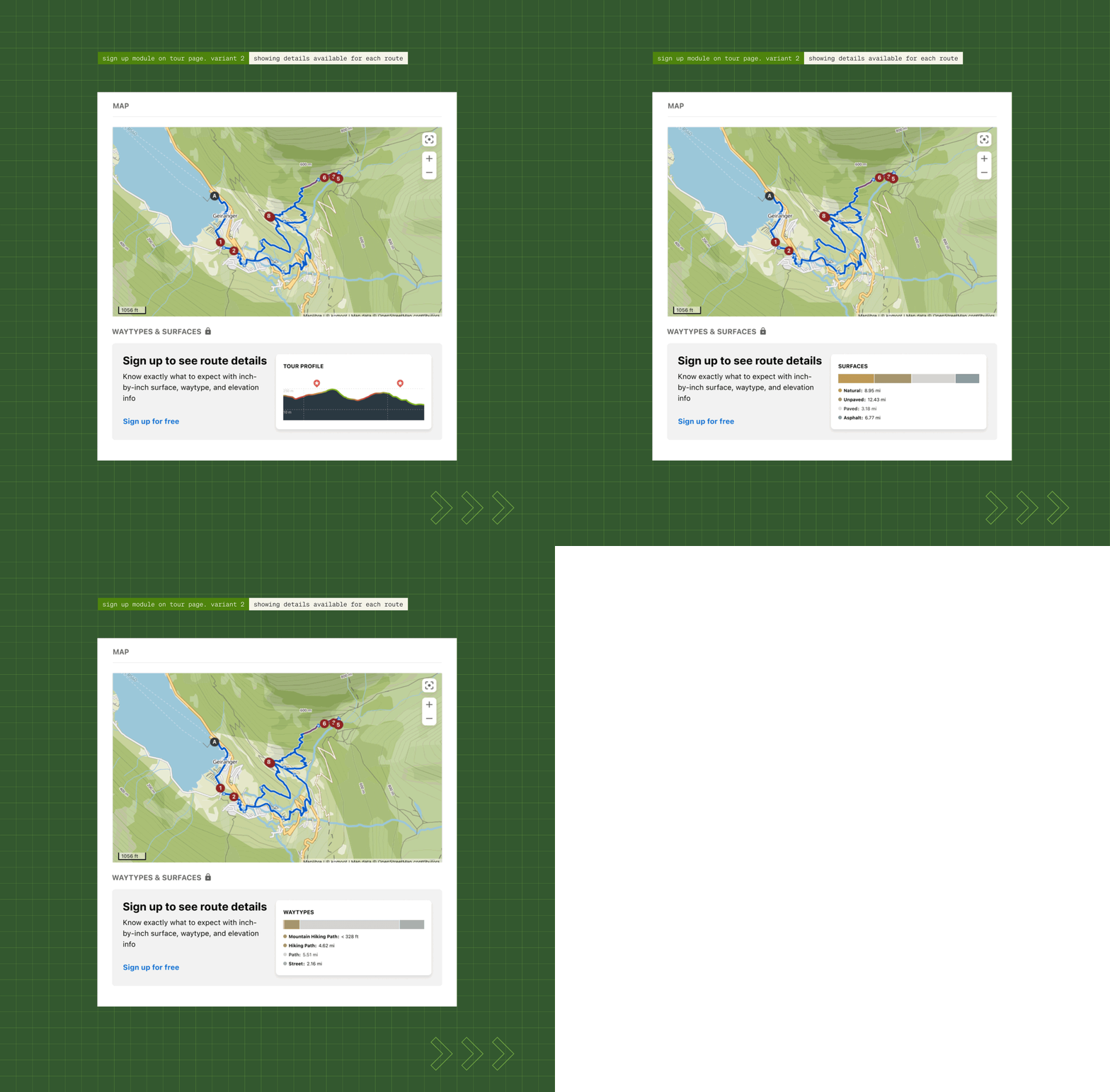
We tested two versions of the end-of-page signup banner on guide pages, and Variation 1 brought in 12% more signups than the control. We rebuilt the signup banner on tour pages the same way, which came out 8% ahead of the control. Both shipped.
→ See Variations 1 and 2 in selected screens
We also changed the timing and targeting of the initial signup popup, and rewrote the copy on buttons and signup modules so that a free account actually reads as free.
What we left out
We had to keep the scope tight, so quite a few things moved further down the roadmap. Removing the signup popup entirely, adding a way to filter routes, rethinking navigation across mobile and desktop, redesigning tour cards to lead with photos, and reworking the main CTAs on those cards all fell out of scope.
Navigation and the tour-card CTAs were the two I considered essential to improving the pages, and the research pointed to both. We couldn’t fit them into the quarter, but we started experiments on them the following quarter.
Results
Across everything the squad did on the activation journey and on guide and tour pages over the year:
- 18–20% of all komoot signups in 2024 came through web
- Signup rate increased 1.96×
- Activation rate increased 2.04× (YoY growth of users coming from the web)
Other work in the squad
Guide and tour pages were one project among many. Over the following months we also picked up several of the things this deep dive had put on the list, and plenty that it hadn’t:
- Improved the CTAs on tour cards
- Smoothed the redirects and transitions between logged-out and logged-in pages
- Fixed site navigation on mobile and desktop
- Experimented with how routes are saved and where people land after signing up, depending on the page they signed up from
- Started on changes to how tours could be filtered
- Started fixing the onboarding setup flows
Guide and tour pages were our highest-traffic, highest-signup content type, bringing in 36% and 45% of all web signups.